Enterprise AI, Delivered
Unlock Value from AI for Enterprises with Unmatched Clarity, Speed and Capability
We are a global AI-native consultancy, guiding organizations from strategy to delivery with measurable, scalable impact.
Built for Speed: The Fastest Path to AI Opportunity
Enterprises want AI results now. We meet that rapidly growing global demand with the combined strengths of custom AI agents, accelerators, and the delivery discipline to move from ambition to production at scale.
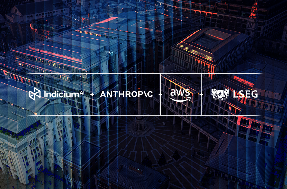
Trusted by Leading Enterprises
We work with some of the world’s most recognized companies. Here are just a few who trust us with their Data & AI transformation.


.png)


We Focus on Delivering Solutions that Address the Core Needs of Today’s Enterprises

Drive Growth
Unlock new revenue streams powered by Data & AI, connecting business priorities to production use cases that scale.
Learn More
Reduce Risk
Build trusted, explainable AI on reliable data foundations, with governance and security designed for enterprise requirements.
Learn More
Lower Costs
Streamline operations at scale by modernizing data workflows, improving reliability, and reducing manual effort across teams.
Learn MoreSolutions Across the Full Data & AI Lifecycle
Choose where you need to start: strategy, build, adoption, optimization. We connect every step to governance and measurable business value.

Strategy & Vision
Defining the path to enterprise AI success, from data strategy and operating models to AI governance, risk, and compliance.

Design & Build
Engineering secure, scalable data platforms and building AI-powered products, analytics, and agentic applications.

Literacy & Enablement
Empowering organizations with the skills, confidence, and adoption programs needed to lead with AI.

Enhance & Operate
Running, optimizing, and continuously improving Data & AI systems to ensure sustained impact.
We Deliver on the Platforms Enterprises Trust, with Partner-led Execution that Accelerates
Time to Value


Global Scale, Proven Delivery, and Deep Expertise: Built to Accelerate Enterprise Outcomes

AMER, LATAM, EUROPE


Delivering Business ROI
Built for the Realities of Your Industry
Industry context changes everything: from governance and compliance to performance and adoption. We bring proven strategies to help you move faster with less risk.